Pat Steir has been creating paintings of the type that were recently on view at Cheim & Read (Feb 20th-March 29th) since 1988, when she famously began her series of “Waterfall” paintings. These large-scale, often vibrantly-hued works were a vast departure from her earlier, figural and text-based work. A quarter-century later, viewing what New York Magazine calls “late-late-late additions to the Abstract Expressionist canon” in person is remarkably impressive.
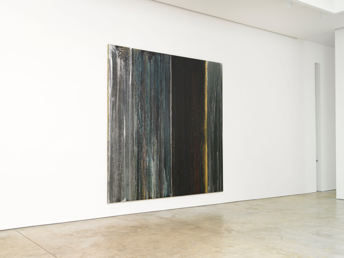
Installation view of Black, Blue, Silver and Gold, 2013. Courtesy Cheim & Read, New York.
Such nods to the art-historical genealogy of Steir’s work are central to many discussions of her painting, and I did find myself assessing the work according to this schema, at least at first. Having seen the lines dividing Steir’s canvases described as “Newmanesque zips,” I understood the use of such art historical shorthand, but was surprised by how little the comparison stood up to close inspection. There was so much more motion depicted in Steir’s work, especially Black, Blue, Silver and Gold, and instead of the divisions suggesting mathematical precision, the vertical lines dividing Steir’s paintings seem to throw off sparks and flecks of color, and the dripped and splashed paint seemed to have flowed with a mind of its own, creating lines that are bent, cut off, segmented, separating out like branches or rivulets from a central point.
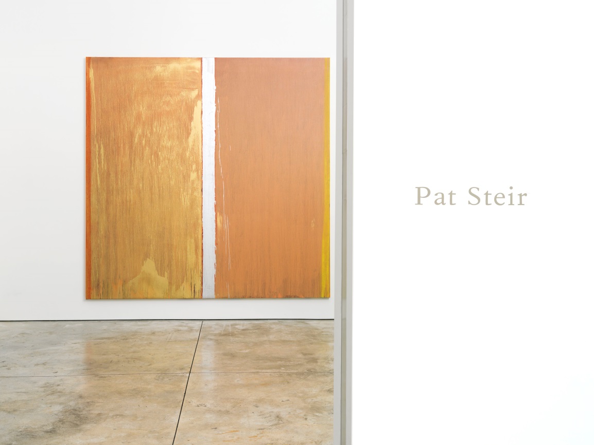
Installation view of Colors without Names, 2013. Courtesy Cheim & Read, New York.
Cheim & Read’s installation certainly allowed viewers to come to such moments of reckoning with the works. This was done to greatest effect in the entrance to the show, where the visitor walked past an understated title wall and into a small room displaying only one work, Colors without Names. Although not the most ostentatious work in the exhibition, this orange and yellow piece, doused in shimmering gold and silver paint, is a fantastic introduction to Steir’s work, and it was absolutely luminous under the sunlight flowing in from the skylight.
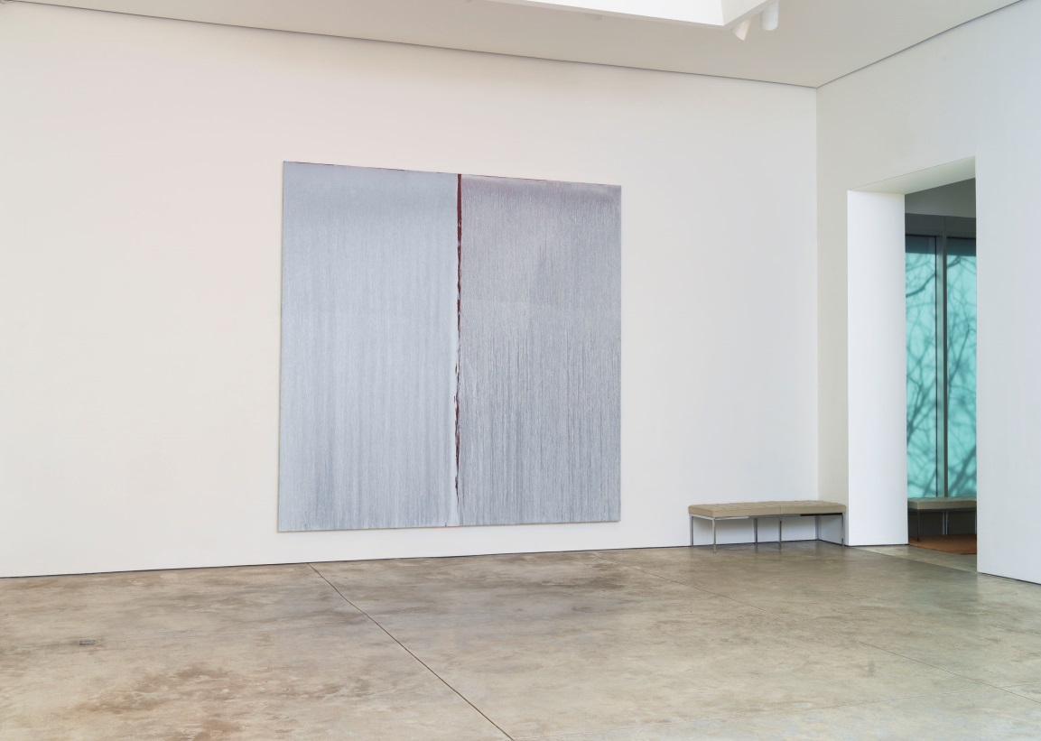
Installation view of Two Whites Over Antique Red Over Cadmium Red, 2013. Courtesy Cheim & Read, New York.
The piece in the exhibition closest to a true monochrome, Two Whites Over Antique Red Over Cadmium Red, was also probably the most rewarding to close-looking. At least from afar, its blueish-gray-white nearly blends in with the cream-based white of the walls and the concrete floor. However, walking closer to the work reveals so much more about this apparently all-white canvas. The two sides of this painting, while both a similar white color, have a completely different texture because of the varying thicknesses and viscosity of the paint poured over each. This effect gives the sense that the right half is a rawer version of the more controlled left half, peeling away to reveal more of the deep red base that actually lies under both halves.
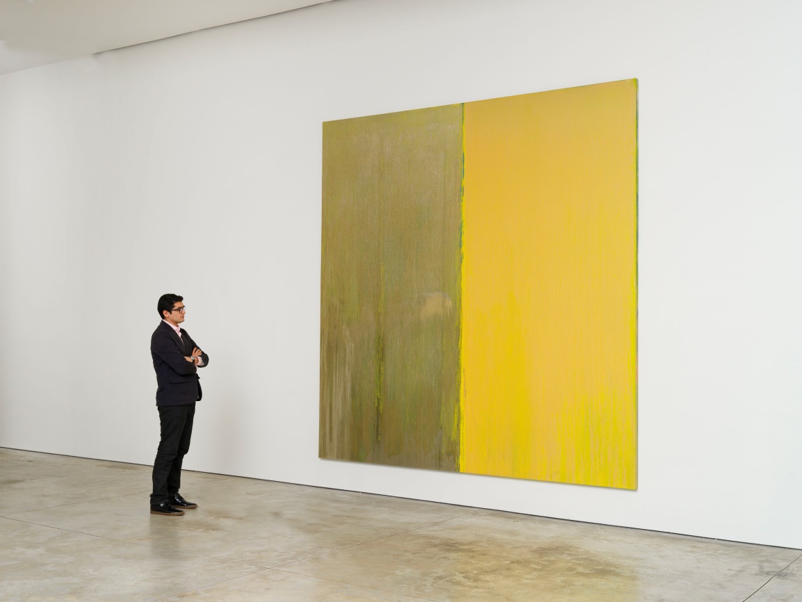
Installation view of Naples Yellow and Mica, 2013. Courtesy Cheim & Read, New York.
Cheim & Reid produced an excellent hardcover catalogue for the show, which is also online. The essay by Raphael Rubinstein, “Essay for Two Voices” applies a number of proverbs from Chinese landscape painting to Steir’s paintings. Especially useful is the traditional precept of “one third fullness, two thirds emptiness,” which Rubinstein suggests is “more like “three thirds fullness, three thirds emptiness” in the case of Steir’s work. Although deceptively simple, this phrase proves a hauntingly accurate depiction of her paintings, as they simultaneously seem to erase and emphasize the artist’s hand. In a 2011 Brooklyn Rail interview, Steir described her technique for controlling the flow of paint in her works as “draw[ing] in air,” and this process allows for aspects of both pre-determined line and random chance-based movement of paint to coexist in her paintings, which simultaneously feel quite intimate and seem to recede into an unknowable distance.
— Laura Indick, Individual Giving Associate