John Ronald Reuel Tolkien’s vision of fantasy has dominated that literary genre for decades. Elves, dwarves, orcs, and hobbits, human rangers and wizards, exist in contemporary fantasy, in novels, games, and television, in the forms that Tolkien cast for them. He has followings both academic and popular, and his literature can and has been meticulously picked apart—it’s layered with translations from one invented language to the next, built on a history and mythology constructed over decades of the author’s life, and cleverly imbued with the same narrative bias found in real historical texts. His drawings work in the same way, but are lesser known. Tolkien the writer, linguist, and historian is a global superstar. Tolkien the artist is not.
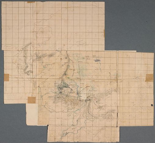
The first map of The Lord of the Rings , c.1937–1949
Black, red and blue ink, pencil, colored pencil, 455 x 492 mm
Bodleian Libraries, MS. Tolkien Drawings 103
Image courtesy of The Morgan Library & Museum.
The Morgan Library & Museum’s exhibition Tolkien: Maker of Middle-earth feels like the missing piece of the Tolkien puzzle. Hardcore Tolkien fans and scholars (of which there are many and of which I will not claim to be one), undoubtedly knew about his drawings all along. At the very least, the maps of Middle-earth are widely known to have been made by Tolkien’s hand. But collecting a mass of his visual material together, the exhibition emphasizes that Tolkien’s holistic approach to his invented world went farther than map making. His illustrations draw from the same well as his writing and language creation, and complete the fantasy-fiction-as-historical-text that draws so many to Tolkien’s world.
The characteristic round door to Bag End welcomes visitors into the exhibition, behind which is placed a reproduction of one of Tolkien’s many watercolor illustrations, this one featuring The Shire and titled The Hill: Hobbiton-across-the Water (1937). This photo-op spot is a nod to the blockbuster nature of the exhibition, and it’s welcoming to casual visitors and superfans alike. Every section title is subtitled in Tengwar, the writing system most associated with Tolkien’s elvish languages Quenya, Sindarin, and Telerin.
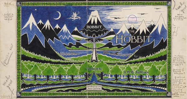
John Ronald Reuel Tolkien (1892 – 1973)
Dust jacket design for The Hobbit , April 1937
Pencil, black ink, watercolor, white bodycolor, 204 x 381 mm
Bodleian Libraries, MS. Tolkien Drawings 32
Image courtesy of The Morgan Library & Museum.
The verdant walls also evoke elves and hobbits, but the exhibition begins with a very grounded peek at Tolkien’s early life. Pictures of the artist with his family and an overview of the pastoral surroundings in which he grew up are accompanied by a series of handwritten letters, including one by Tolkien’s mother. Mabel Tolkien’s handwriting has the steady fluidity that her son would also adopt in his writing, and which would become a recognizable element of tengwar. His interest in writing, letters, and calligraphy was later fed by his study of linguistics and medieval manuscripts, enhancing this connection.
Like his early writing influences, Tolkien’s earliest illustrations are not explicitly linked to Middle-earth. His upbringing in rural and suburban England suggest the visual seeds for the Shire, as does an early sketch of one of these quaint landscapes shown near his mother’s letter. The Book of Ishness, from 1911 to 1914, serves as a kind of link between these landscapes studies from Tolkien’s early life and the more fantastical work that would accompany his world-building. As the name suggests, the drawings in this sketchbook dwell on less concrete concepts, like “eeriness.” They provide insight into how Tolkien began to explore color, abstraction, and stylized natural forms to represent otherworldly environments and experiences.
Another early section in the exhibition makes a point of highlighting the letters that Tolkien wrote to his children, along with illustrations “from Santa Claus” completed in the 1920s. Even in such a casual exercise, his attention to detail is apparent. The letters are even written with a jolting hand, as if the author is shivering at the North Pole. This whimsical sense of authenticity accompanies drawings and watercolors that similarly work to achieve a full picture of Santa Claus as the sender. Each drawing is signed with an “FC” at the bottom right, presumably for “Father Christmas,” and often in the same shivering penmanship. In works like the 1926 Drawing by Father Christmas of the Aurora Borealis, Tolkien privileges the landscape and atmosphere of the North Pole over Santa himself, showing a stylized sky flickering with solid spikes of color over a cool icy landscape. Through a combination of art, writing, and inventive mimicry he creates a credible existence for a fairy tale figure.
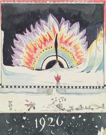
John Ronald Reuel Tolkien (1892 – 1973)
Drawing by Father Christmas of the Aurora Borealis, December 1926
Watercolor, black ink, colored pencil, pencil, 231 x 178 mm
Bodleian Libraries, MS. Tolkien Drawings 46
Image courtesy of The Morgan Library & Museum.
After laying this groundwork, the exhibition makes its way finally to The Hobbit, choosing to approach Tolkien’s works roughly in order of publication. The standout works of the exhibition are in this section, including the original green, blue, and black book jacket design for the first George Allen and Unwin edition of The Hobbit. Notes scribbled in the margins indicate changes for publication, including the removal of the red sun on the cover to limit printing costs. This cover, from 1937, incorporates the sharp, flat shapes seen in pages from the Book of Ishness and in Tolkien’s Santa Claus drawings, carefully delineating forest, sky and the Grey Mountains using outlines in white and black. This graphic quality to Tolkien’s drawings made them perfect for book covers and illustrations, picking up on art nouveau illustrations and textiles from the turn of the century for his flat, linear, and decorative approach to nature. At the same time, many of Tolkien’s drawings in this style were never intended to be translated to print. Drawings in the Book of Ishness fit into this category, yet were rendered in flat blocks of color that have the quality of a woodblock print or engraving.
Another example of this print-like drawing style is on display near the book jacket, in two black and white drawings. The Trolls uses heavy stippling and delicate lines of white in otherwise solid black trees to describe the moment when Bilbo’s traveling party comes upon trolls around a campfire. The stark white of the fire barely illuminates trolls hidden in the tree line behind, while Bilbo is shown in thin detail in the extreme foreground of the image. Tolkien’s sparing use of light, in addition to his reliance on straight lines of light and dark to add value to the image and the oblong, almost rectangular, dots of white all create the illusion that the work isn’t a drawing at all, but is in fact a wood engraving. In making his drawings look like prints, Tolkien is applying the same logic he used for his Santa Claus drawings. Instead of simply creating a drawing to illustrate a scene from a fiction, Tolkien treats the work as if it is a real part of the world he is showing us. The engraving effect suggests that the work is in the kind of historical record or story that Tolkien, as a medievalist and a linguist, would have studied and drawn inspiration from. While creating an effective graphic image, he also introduced the possibility that the artist was not, in fact, Tolkien, but Bilbo Baggins or another traveling party member.
The section of the exhibition that focuses on The Lord of the Rings gives time to Tolkien’s cover art, maps, sketches, and pages planning the writing that was to appear on the One Ring when exposed to fire. The fire writing allows visitors another glimpse at the way Tolkien shaped the existence of a world that has since taken his creations farther. On one page from 1953, he writes the same passage in tengwar over and over again, in red and black, with different qualities to the letters. Jagged and angular or fluid and looping, with diacritics that range from dots to dashed crowns atop each tengwa (letter), the styles of these passages give us a glimpse into the visual equivalent of Tolkien’s layered approach to the character of his spoken languages. His letters weren’t just a functional exercise, a means of writing his languages. They were also a stylistic one. This and other pieces of handwritten Tengwar, in addition to Cirth, his runic system, reveal how he took on the role not just of inventor but of typographer. His linguistic interests combined with his aesthetic interests, again drawing on art nouveau and the arts and crafts movement—which was similarly concerned with a multifaceted creative production.
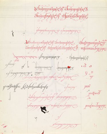
The Fire-writing , 1953
Red and black ink, pencil, 254 x 203 mm
Tolkien Trust, MS. Tolkien Drawings 90, fol. 39r
Image courtesy of The Morgan Library & Museum.
Much like Tolkien’s world, Tolkien: Maker of Middle-earth had too much to explore for a single visit. Doodles in the margins of his sunday crossword evolved into the decorative elements of Middle-earth and into elvish heraldry, while gridded maps had pages added to them as Tolkien’s world grew before him. The exhibition gives a distinct impression that his exercise in world building and in story telling seeped into every facet of his life, and drew equally from his varied areas of interest, both personal and academic. His visual work completes this picture, building what has become the prototypical fantasy from the author’s own reality.
Tolkien: Maker of Middle-earth at the Morgan Library & Museum runs from January 25, 2019 to May 12, 2019. The exhibition was organized by the Bodleian Libraries, University of Oxford in collaboration with the Morgan Library & Museum, New York with the support of The Tolkien Trust.
—Isabella Kapur, Curatorial Assistant