The Drawing Center’s intern Kate Smith recently visited the studio of Queens-based artist John O’Connor. She documented their conversation on his drawings using logos and advertising texts, among other appropriated information, for The Bottom Line.

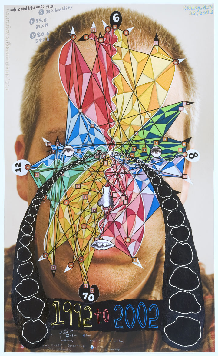
John O’Connor, Self Portrait, 1992 to 2002, 2013. Colored pencil, graphite, and acrylic on photograph, 52 x 43 inches. Image courtesy of the artist.
Kate Smith: When faced with a blank piece of paper, how do you know where to begin?
John O’Connor: Well, I keep a notebook. For example, I wrote down… (he skims his sketchbook and stops) … “immortality”! I read something about this immortal jellyfish in The Science Times that I thought was interesting and I might play around with that idea. Mostly I’m drawn to ideas that I can figure out how to translate into a visual thing.
KS: Do you find yourself returning to any particular ideas or images?
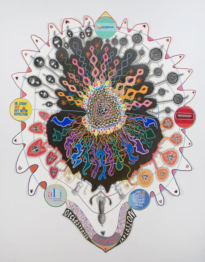
JO: I don’t know if there’s one specific thing that I keep returning to. I’ve done a couple drawings about the effects of medication and marketing of drugs on the body. And in this one (gesturing to his drawing Implosion Explosion), the shape was made by the logos and information related to diet drugs and diet books marketed by these companies. I translated that information into a pattern and let it grow—as if all of these diet-related drugs and books that are meant to shrink the size of the body are now actually doing the opposite. As if it does what it’s not supposed to do, intentionally.

John O’Connor, Implosion Explosion, 2013. Graphite, collage, and colored pencil on cut-out paper, 74 x 65 inches. Image courtesy of the artist.
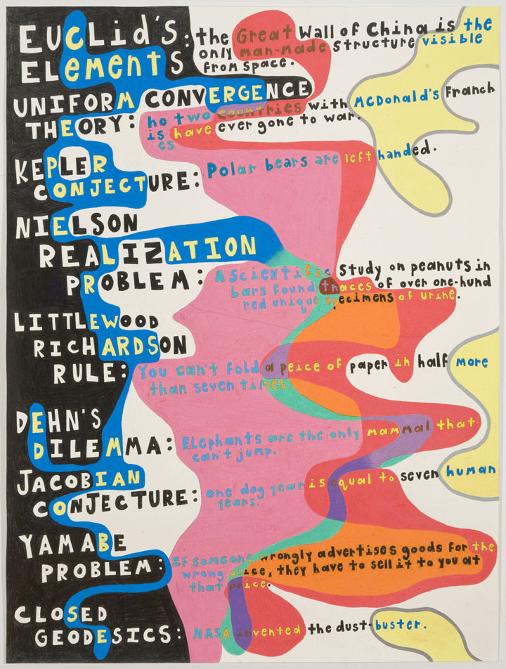
I’m always interested in information that is presented as seeming to be true, when it’s not really at all. Those (pointing to his drawing Fact-ion) were theorems that I found that are known to be true, but are not actually proven, and these (pointing to another part of the same drawing) are scientific myths that people believe—so I just shoved them together. If you put this next to this, in a way that “seems” like a diagram, does it read as something that is, more or less, believable or true? I use a lot of information but I never really know if the information is true or provable. I even use statistics, but how do I know if they’re actually real? It’s more or less all a fiction that I manipulate.

John O’Connor, Fact-ion, 2013. Graphite and colored pencil on paper, 36 x 30 inches. Image courtesy of the artist.
KS: With so much language and visual information embedded in your work, is there something specific you’re trying to convey?
JO: I don’t really read them in terms of language so much anymore. I don’t know if other people do. Instead, I see the drawings as both content and visual patterns of language, color, and form. I sometimes don’t even read them as words once I put them down. The work that I like the most—as with the work of Alfred Jensen—are the pieces where I might be able to understand some of what’s happening in terms of the information he gives us, but the visual part is what really ends up taking over—pattern, color. I hope that the work gives people an inkling of what’s happening, that there’s something they could know more about, but I feel like if it were too clearly spelled out, it might lose something that makes it art.
Ideally I want people engage more actively with a drawing. Almost as though they’re solving a puzzle or decoding it in some way, while, simultaneously looking at it visually. For me, the more convoluted it is, the more interesting it is, but then it’s also harder to know how much it’s going to ultimately communicate. It’s something I think about a lot, not so much while I’m working, but more when I show things: how much should I talk about the work? I write little things about the works too. I think of the art of Paul Laffoley, a guy I really admire, and sometimes the information he uses is really difficult to access, but I love looking at it.
KS: Do you think of the writing as a separate piece?
JO: Yeah, I started doing it initially to help the gallery talk about the work. Now, I think of it as its own thing and I really try not to write about the content, but mainly describe the process in a straightforward way. The written descriptions are not really formulas for following how a drawing was made. They’re almost independent pieces.

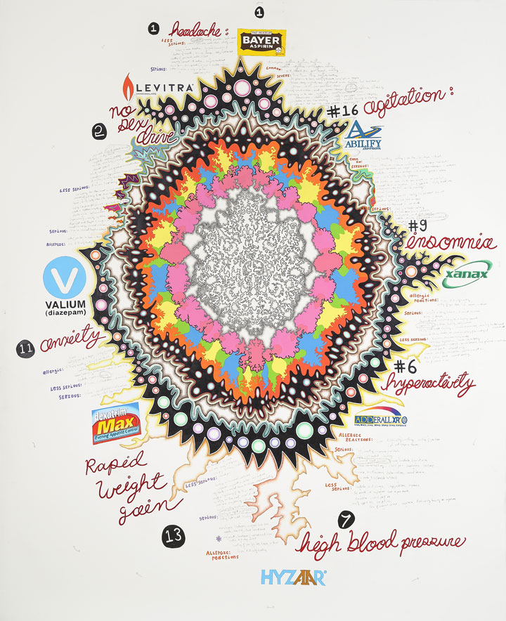
John O’Connor, Drug Loop, 2011. Colored pencil and graphite on paper, 88 x 72 inches. Image courtesy of the artist.
KS: You’ve started working on more textured and heavily worked surfaces that seem to oppose the clean, graphic flatness of so much of your work. What is this about?
JO: I love that look of a graphic mark on top of a textured surface. It reminds me of a wall with graffiti on it. The thing is formed and has its own surface and you impose this pattern on top. It flattens it out in some way and makes it more optical. I also like the look of advertising, that kind of graphic look, the logo. But in these works it’s as though the logo has aged and been torn away and you see it deteriorate.
KS: Similar to the flattened cans you have hanging by the door.
JO: In those I used the dimensions of the can to form the text. I measured the circumference of it and translated that into a letter—so, if it was one inch long it was the letter A, if it was two inches long it was the letter B. Then I put those letters together into an electronic dictionary that assembles them into a word. It came up with “SCRIMP” and “SCRAP” and then I painted those words on the surface of the cans.
It’s as if the cans themselves communicated in some way. The can gets thrown on the ground and run over, but then if you take that shape, that thing that happened somewhat by chance, and you pull something out from it, then it becomes language or more of a particular thing of that specific time.
All of my work has that. I love abstraction that feels as though it’s tied to a specific thing. I love mystery. I take all the information I can find about a mystery and try to make a shape out of it.
KS: So you’re trying to make the intangible tangible?
JO: Yeah. I also love the way a shape looks when I haven’t just drawn it myself intuitively. I feel like I would never in my entire life make a drawing like this (he points again to Implosion Explosion) out of my head. It’s because you come to have some relationship with the idea and the stuff you’re working with. Those things force you to make the shape in some way or use a certain color, and you can only force it to do so much. You have to let it be what it wants to be, somehow.
For more information about John, check out his website johnjoconnor.net and look for information about his upcoming show and catalogue covering ten years of work at Pierogi Gallery in Williamsburg.
